Appsolute Management Console
A Web-Based SaaS Dashboard That Helps Fintechs and Microfinance Banks Manage All Their Services in One Place.
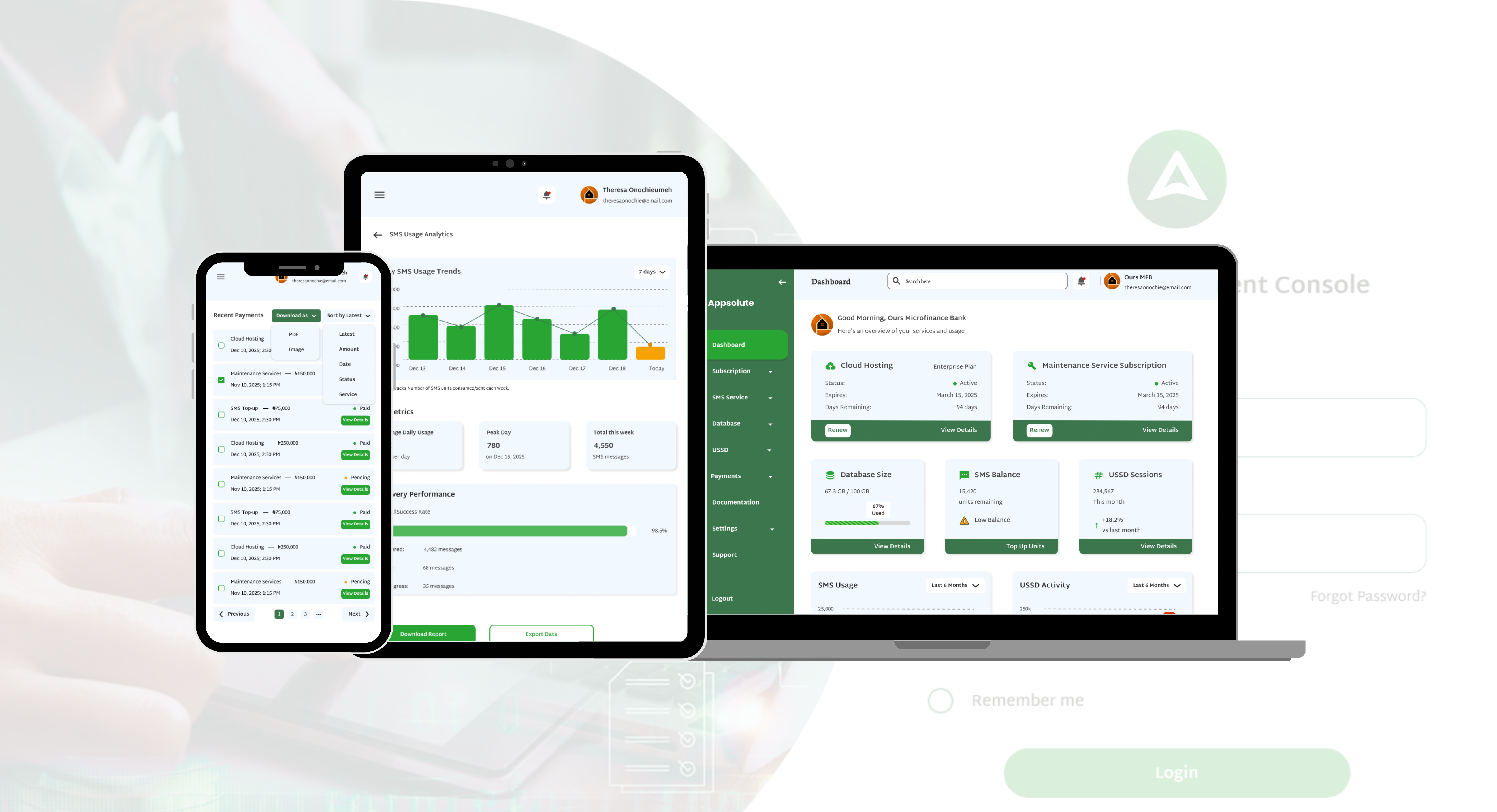
A Web-Based SaaS Dashboard That Helps Fintechs and Microfinance Banks Manage All Their Services in One Place.
Appsolute is a fintech company that builds and manages mobile applications for microfinance banks, fintechs and corporations. This management console is an internal web dashboard where their clients can log in and manage everything from cloud hosting and SMS credits to subscriptions and payments all in one place.
It is an internal management portal that Appsolute built for their clients. When a microfinance bank or fintech company uses Appsolute's services, they get access to this dashboard where they can see the status of all their active services, renew subscriptions before they expire, top up SMS credits, track usage and manage payments without having to call or email anyone.
Before this, clients had no central place to see what was expiring or what they owed. Things like cloud hosting renewals and SMS top-ups were handled manually which meant delays, confusion and potential service interruptions. The goal was to give clients full visibility and control through a clean self-service portal.
I was the Product Designer for this project. I designed the full web application from login through to each feature module, across three responsive breakpoints for desktop, tablet and mobile. I also designed all the empty states so the dashboard communicates clearly even for brand new clients who have not subscribed to anything yet.
What I was trying to achieve with every design decision in this project.
The dashboard needed to tell the client the most important things the moment they logged in. What is expiring, what is low, what needs attention. No digging around required.
Clients should be able to renew a subscription, top up SMS units or change their plan entirely without having to contact the Appsolute team. Everything should be doable from within the portal.
This is a web app for business use but clients still need to check on things from their phone or tablet. Every single screen was designed for desktop, tablet and mobile.
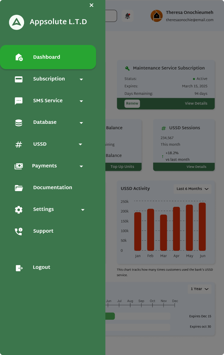
The sidebar needed to be clear and organized. It can expand to show full labels or collapse to just icons. Getting to any section should never take more than one click from anywhere in the app.
The system should warn clients before things go wrong. Low SMS balance, subscription expiring soon, payment failed. All of these should surface as clear, visible alerts that are hard to miss.
A new client who has not subscribed to anything yet should still have a good experience. Every empty state was designed with a clear message and a direct call to action to get started.
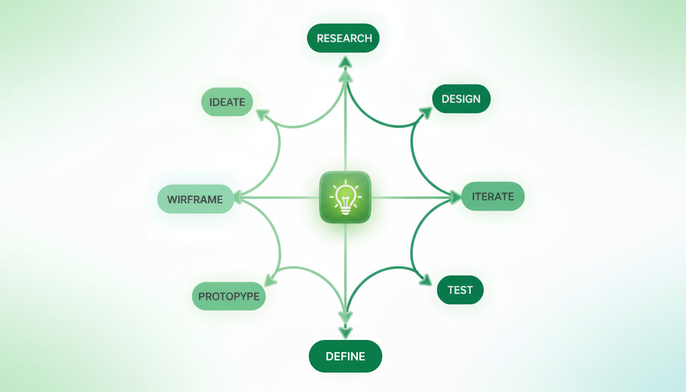
I followed a structured process from understanding how Appsolute's services work to delivering a fully responsive design across all modules.
Designing a B2B management console comes with its own set of problems:
Here is how I tackled each challenge:
The two types of people who would be logging into this portal regularly.
Getting into the mindset of an operations manager who needs to keep all her services running without disruption.
Understanding what she is dealing with when managing external services for her organization
How a client moves through the console from logging in to completing any task.
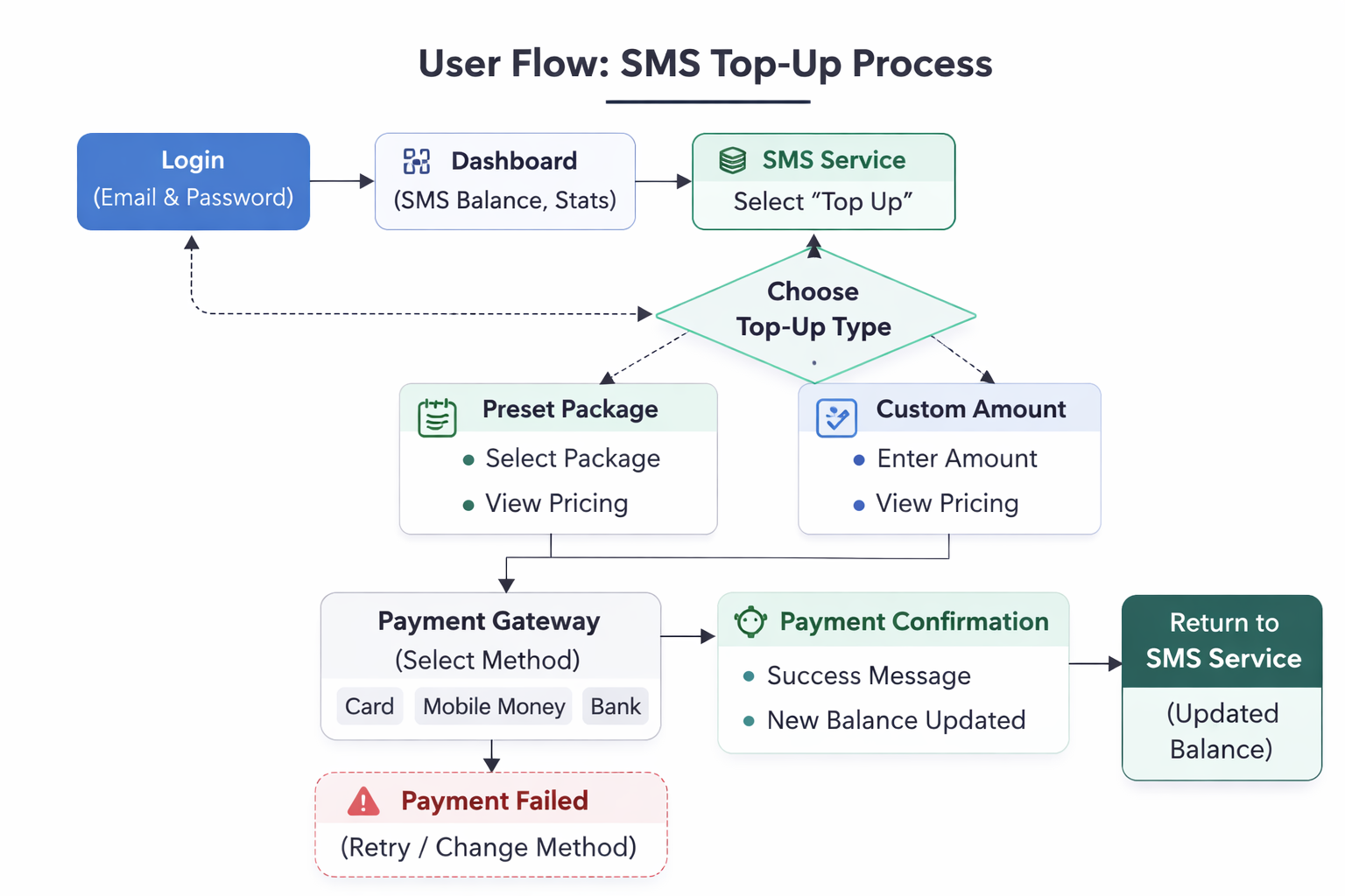
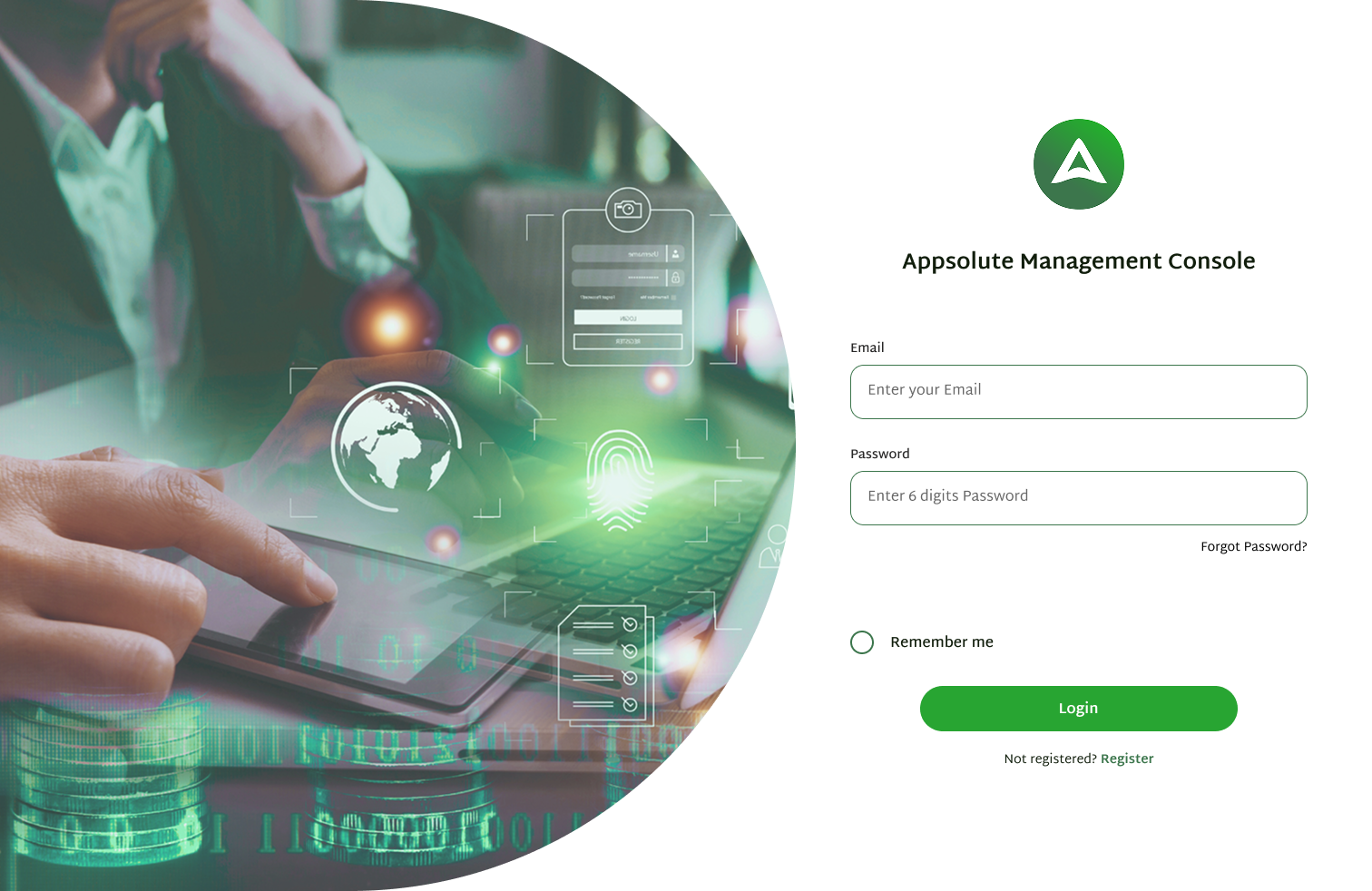
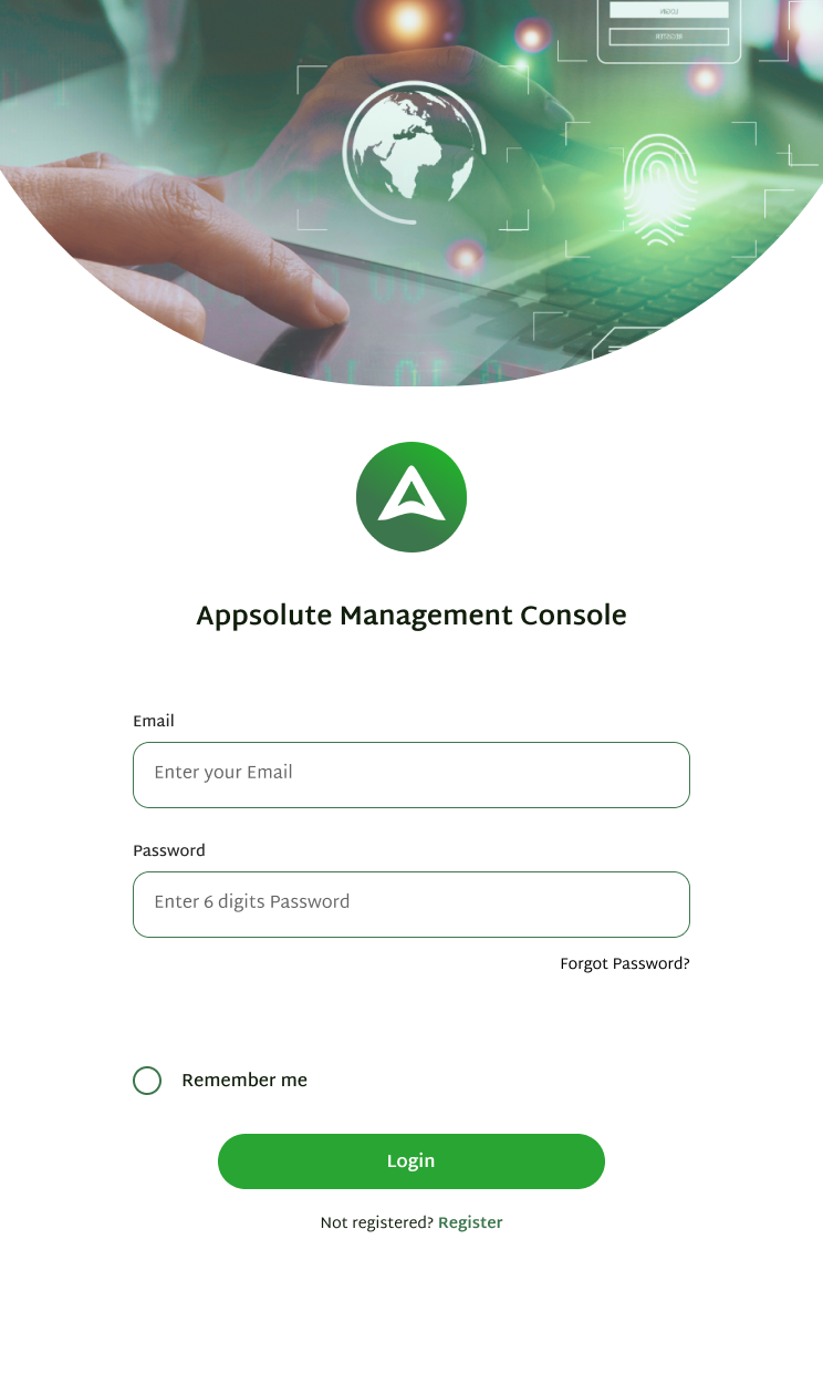
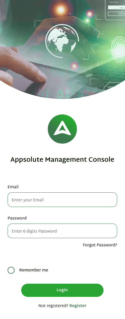
1. Login: Client logs in with their company email and password. Clean, focused screen with a remember me option and register link for new clients.
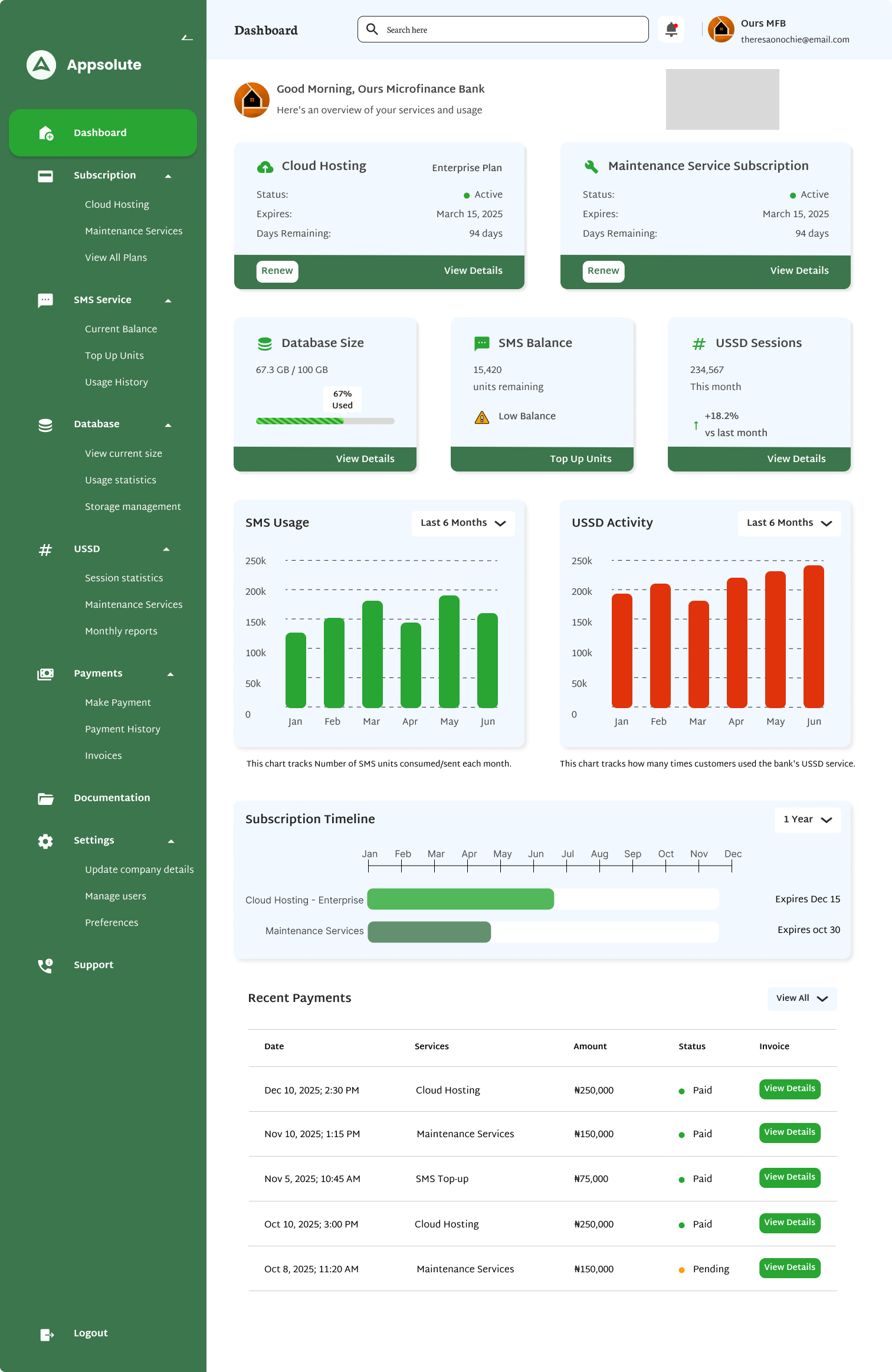
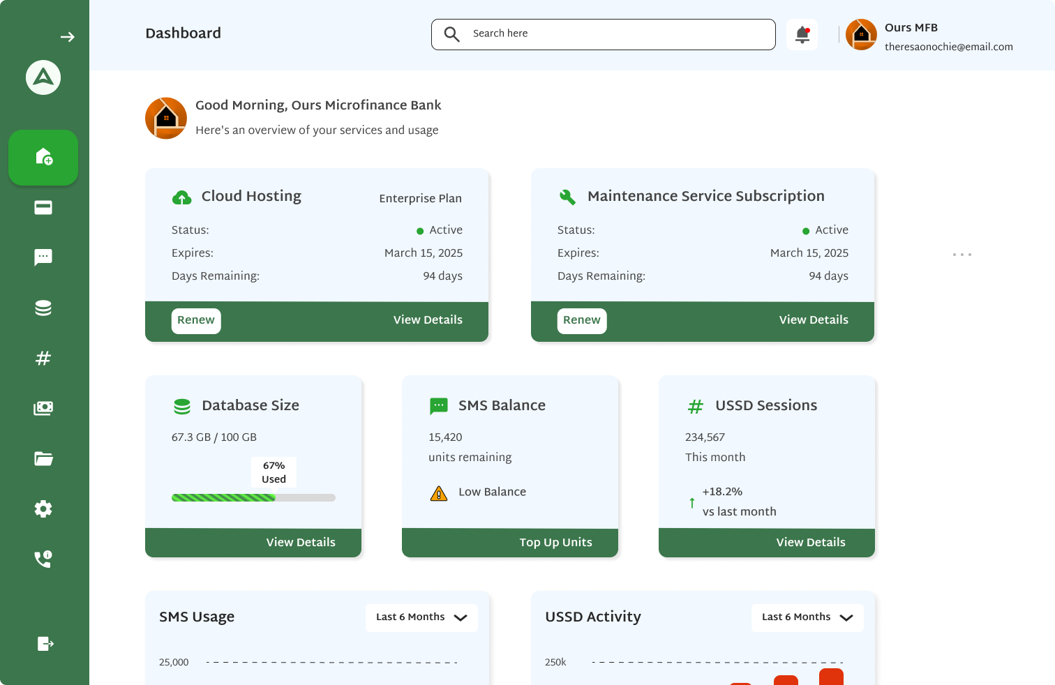
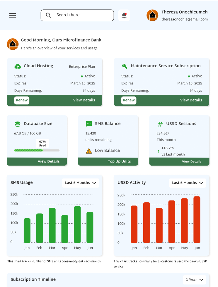
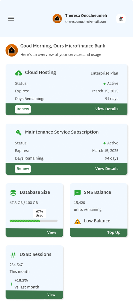
2. Dashboard: Shows cloud hosting status, maintenance service status, database size, SMS balance, USSD sessions, SMS and USSD usage charts, a subscription timeline and recent payments all in one view.
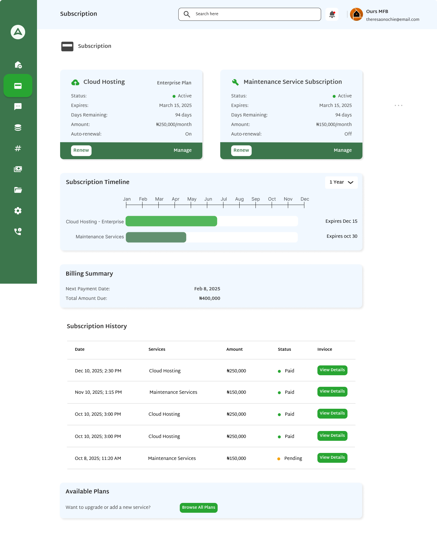
3. Subscription: Shows current cloud hosting and maintenance plans, a visual expiry timeline, billing summary and full payment history. Clients can renew, manage their current plan, and browse available plans with a side-by-side comparison table.
4. SMS Service: Shows current balance, quick stats, a 7-day usage bar chart and recent usage history. Clients can top up, view full usage history with filters, and view analytics including daily trend charts and delivery performance.
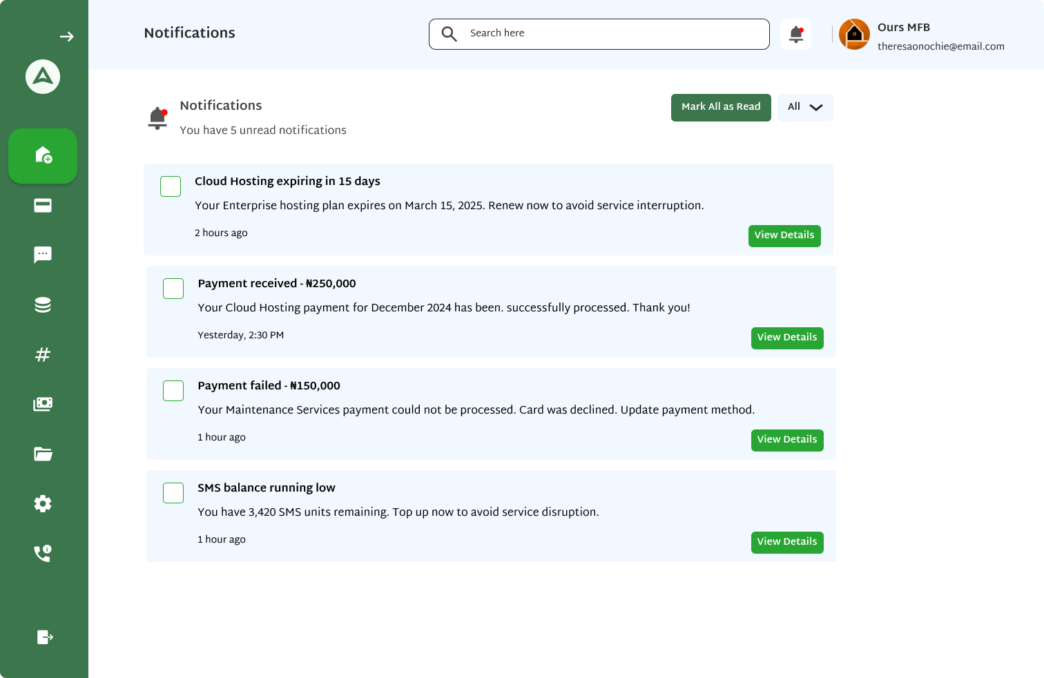
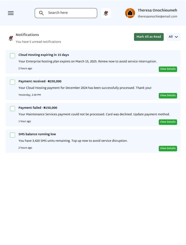
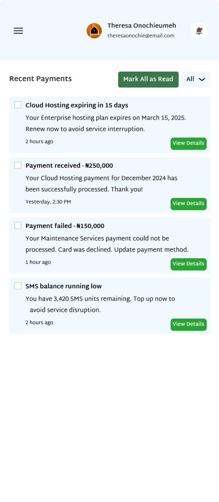
5. Notifications: Surfaces alerts for expiring services, successful payments, failed payments and low balances. Notifications can be filtered by category and marked as read individually or all at once.
A consistent visual language that makes a data-heavy dashboard feel clean and easy to read at any screen size.
Green is the brand color and signals active, healthy and positive states throughout the app. Red is used specifically for alerts, warnings, failures and anything that needs urgent attention.
A clean Martel Sans font that makes tables, numbers and labels easy to read across desktop and smaller screen sizes.
Large stat numbers like SMS balance and USSD sessions use Bold weight so they read instantly. Table body text uses Regular. Column headers use Semi-Bold. All monetary amounts display with the ₦ Naira symbol.
The main modules of the console and what makes each one useful.
The dashboard is designed to give clients a full picture of their services the moment they log in. At the top you see cloud hosting and maintenance subscription cards showing status, expiry date, days remaining and a direct renew button. Below that are stat cards for database size, SMS balance and USSD sessions. The page also has a 6-month SMS usage chart, a USSD activity chart, a full-year subscription timeline and a recent payments table. The empty state version is just as thoughtful with specific prompts and action buttons for every empty section.
The subscription section covers cloud hosting and maintenance. For each one clients can view their current plan, renew by selecting a duration of 1, 3, 6 or 12 months with live pricing, and manage their plan to view compute resources, storage and bandwidth usage. Clients can also change their plan, browse add-ons, set auto-renewal and cancel. The available plans page shows all tiers side by side with a feature comparison table at the bottom.
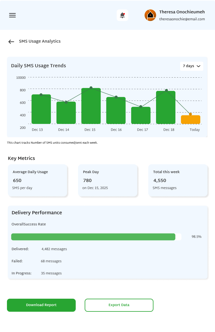
The SMS module starts with an overview showing available SMS units, this month's usage, a 7-day bar chart and a recent usage history table. A low balance alert banner appears automatically when units are running low. The top-up flow lets clients pick from preset packages or enter a custom number of SMS units. The analytics screen has a daily SMS usage trend chart, key metrics cards and a delivery performance breakdown.
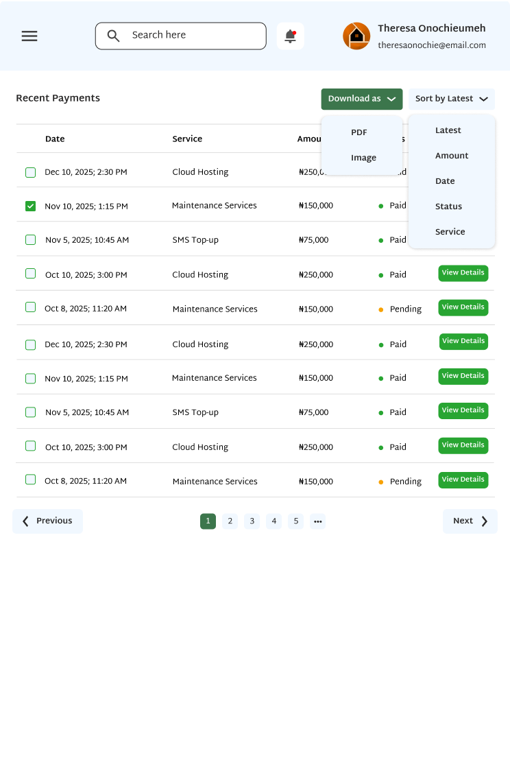
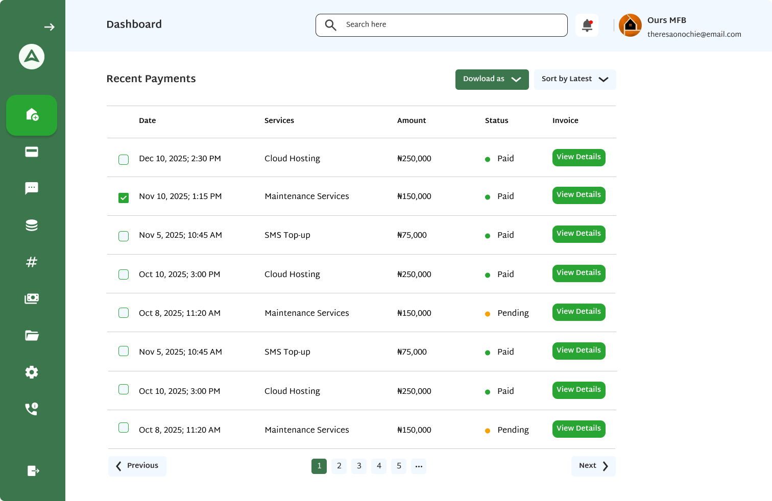
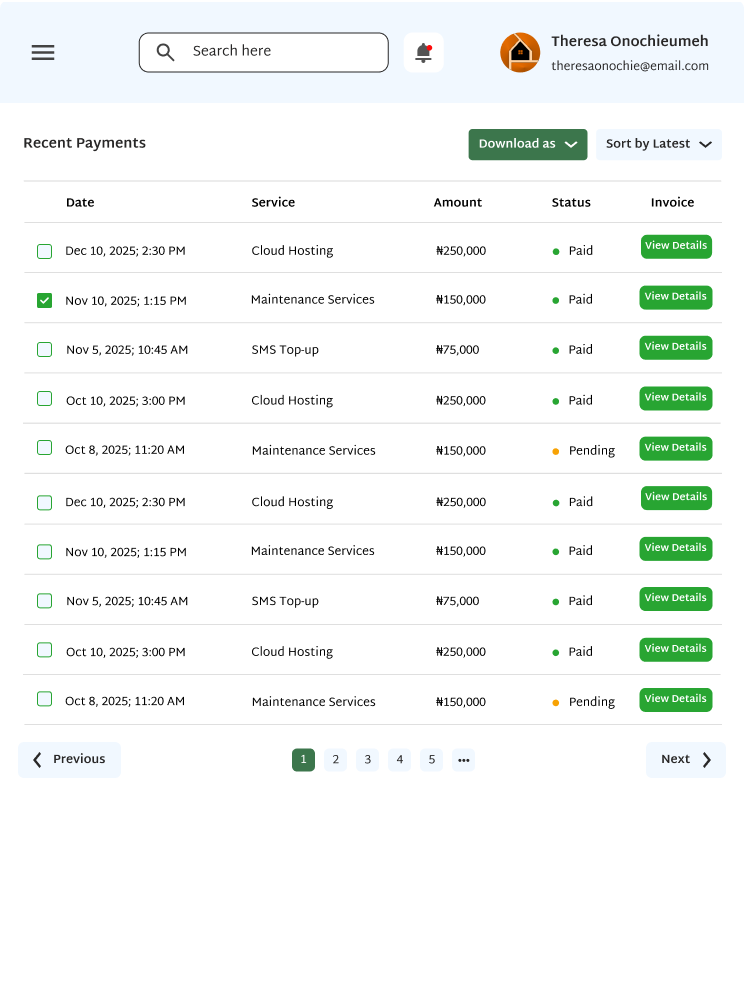
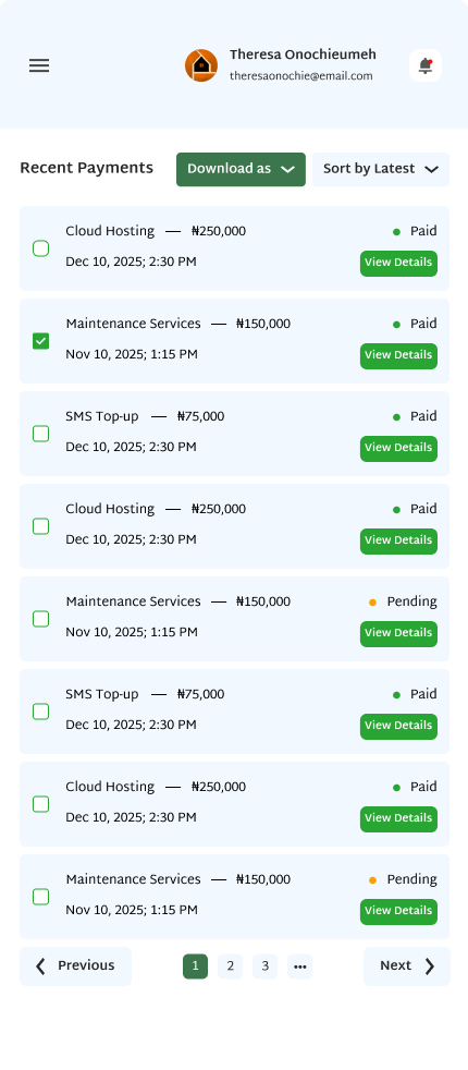
The transactions section is a full paginated table of every payment made across all services. Each row shows the date, service name, amount, status and a view details link. Clients can download the table as PDF or image, sort by any column and open individual payment details with a full invoice breakdown. The notification system surfaces time-sensitive alerts for expiring subscriptions, payments and low balances.
The sidebar is one of the most important parts of the app because clients spend their whole session navigating through it. I designed two states — expanded with full text labels and collapsed to icon-only mode. Both states work cleanly at desktop, tablet and mobile breakpoints. The logout button sits at the very bottom of the sidebar so it is always accessible but never in the way.
The same four screens shown across all three responsive breakpoints — how the console adapts across every device a client might use.
What this project delivered.
Designing this management console was a different kind of challenge from designing mobile apps. With a mobile app you are usually dealing with one task at a time and a focused, simple flow. With a web dashboard you are dealing with a lot of information across multiple sections and the challenge is making all of that data feel organized and not overwhelming.
The part that took the most thought was the dashboard itself. The key was deciding what to show first and making sure the most urgent things like expiring services and low balances were always visible at the top, not buried.
Designing the empty states was something I put real effort into on this project. Each empty section has its own message explaining what will appear there and a direct action button so the client knows exactly what to do.
Doing 43 frames across three responsive breakpoints also taught me a lot about building a proper component library before starting. Once I had set up the sidebar, cards and table components correctly, adapting them for tablet and mobile was much faster.
This project also showed me that I enjoy designing web applications. Dashboards, data tables, analytics, management flows. There is something satisfying about organizing complex information into something that feels intuitive and clean.
Whether it is a web app, mobile app or product design, I would love to hear about your project.